使用 CSS3 制作自己的博客 Logo
文章目录
1、html 代码
1 2 3 4 5 6 7 8 9 10 11 12 |
<div class="wenyi-logo">
    <div class="border">
        <div class="circle">
            <div class="wy">
                <div class="wen">文</div>
                <div class="yi">翼</div>
                <div class="bo">博</div>
                <div class="ke">客</div>
            </div>
          </div>
    </div>
</div> |
2、设置 logo 大小为 180px,设置所有的 div 为绝对定位
1 2 3 4 5 6 7 |
.wenyi-logo {
    width: 180px;
    position: relative;
}
.wenyi-logo div {
    position: absolute;
} |
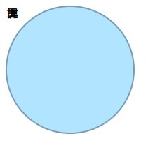
3、设置 border 样式
1 2 3 4 5 6 7 8 |
.wenyi-logo .border {
    width: 180px;
    height: 180px;
    background: #b1e4ff;
    border: 2px solid #789cb6;
    border-radius: 90px;
    box-shadow: 0 0 15px #fff;
} |
可以看到,现在的效果:
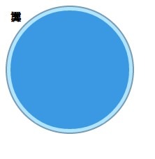
4、设置 circle 样式
1 2 3 4 5 6 7 8 |
.wenyi-logo .circle {
    width: 170px;
    height: 170px;
    top: 5px;
    left: 5px;
    background: #3b99e3;
    border-radius: 85px;
} |
可以看到,现在的效果:
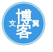
5、设置字体的大小以及定位
1 2 3 4 5 6 7 8 9 10 11 12 13 14 15 16 17 18 19 20 21 22 23 24 25 26 27 28 |
.wenyi-logo .wy {
    font-weight: bold;
    font-size: 70px;
    color: white;
}
.wenyi-logo .wy div {
    width: 96px;
    line-height: 96px;
    text-align: center;
}
.wenyi-logo .wen {
    font-size: 32px;
    top: 37px;
    right: -85px;
}
.wenyi-logo .yi {
    font-size: 32px;
    top: 37px;
    left: 88px;
}
.wenyi-logo .bo {
    left: 37px;
    top: 9px;
}
.wenyi-logo .ke {
    left: 37px;
    top: 69px;
} |
可以看到,现在的效果:
6、最后加上鼠标经过的样式
1 2 3 4 5 6 7 |
.wenyi-logo .border {
    transition: all .8s ease-in-out;
}

.wenyi-logo .border:hover {
    transform: rotate(360deg) scale(1.1);
} |
7、最后的最后>>>
加上对多浏览器的支持,列出了用到的 css3 属性:
1 2 3 4 5 6 7 8 9 10 11 12 13 14 15 16 17 18 19 |
-moz-border-radius -webkit-border-radius -o-border-radius border-radius -moz-box-shadow -webkit-box-shadow -o-box-shadow box-shadow -webkit-transition -moz-transition -o-transition transition -webkit-transform -moz-transform -o-transform transform |
注:想支持 IE 的话可以考虑 ie-css3.htc
源码:查看demo
文章作者 wenzhixin
上次更新 2012-12-07